coloring sketches
We all know this situation: There's this really awesome Sketch, shouting "post me at some board" but it isn't yours. So how to become rich an famous with this foreign-artists work? Easy Going!
In this Tutorial i'll show step-by-step how to change a greyscale sketch into a colorful picture that's not even too ugly.
- Basics - Introducing into Photoshop and preparation of the Sketch
- Fundamental - Clean coloring of single shapes
- Light and Shadow - Creating Highlights
- Background - Adding a Background and inserting the Painting
- Epilogue - Wise words last
Basics
Preparing Photoshop
This Tutorial is written to fit Photoshop6, other versions may have minor differences, hail to the manual. Basically you should know how to work with Photoshop, ie choosing colors, using tools etc.
We'll be using Layers a lot, so make sure to have the Layerwindow visible (Window -> Show Layers). Same thing for Tool Options (Window -> Show Options) and the Tool Bar (Window -> Show Tools).
Choosing and preparing the Sketch
The better the Sketch is shaded before you work with it, the easier the following steps are and the better your result will be. But with this, the artistic factor will decrease. Which type of sketch you choose afterwards is completely to you, but for the beginning i suggest not to use pure lineart as the untrained Colorer will least possibly achieve a nice result.
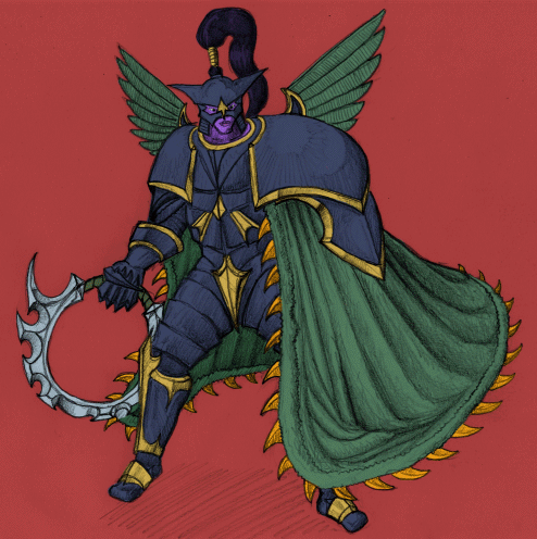
 I chose Fekals Warden from a German WarCraft3-Board for this tutorial and dragged it simply into my Photoshop. Now double-click the only Layer in your Layerwindow and name it. Since the later steps are way more easy with proper naming of layers, I always name the first one "Sketch". Also set it's Blendmode to Multiply, so we may paint "under" the sketch.
If you like you may increase the sketchs brightness a bit, to get a clean white background. But since i like this greyish touch, i'll just leave this step out. Now the time has come to fix minor "Mistakes" in that sketch, as there are hasty erased lines or objects you don't want to color. Just paint them over with a fitting color (white in most of the cases).
Fundamental
Essentials
The most work-intense but also most important step when coloring a sketch is the first Layer of Paint. Here the single Parts of the sketch will be colored, without paying attention on Highlights n Stuff.
The easiest way to do it is this:
First create a new layer (Ctrl+Shift+N) and name it "Background". Now fill it with a not too saturated not too bright color. #b04040 would be a nice red. This layer will be deleted after coloring the single parts, but supports us contrast for now. So make sure to fill it with green when painting with red, fill it with blue when using yellow etc. Press Ctrl+U and fool around with the Hue-settings to do it fast. But now, drag that background to the bottom of your layerwindow.
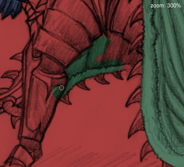
 So after we created the background and watched speechless how the sketch isn't black on white anymore but black on red, we may start with the actual coloring. I often work zoomed in to 200%-300% (Ctrl++ and -) using all kind of hardedged brushes (
 ). So create a new Layer, move it just above your background and zoom in a bit to be able to work more precise. Then just take a somewhat fitting color and paint a certain area, like the skin. After this, create another layer and move it just above the background again. Then pick another color and paint another area. I found it handy to start with bigger areas, so it's easier to do the small things afterwards.
Advanced
 Although it's possible to paint the whole sketch with the knowledge you just achieved, there are some hints to shorten the time taken. Sometimes when coloring you'll have to paint very thin parts or something. Don't be afraid to just paint heavy over the border and erase outer parts afterwards.

This picture is an animation of different layers. Pay attention on how hasty the lower ones are painted and realize, that i already thought about shading afterwards, so i used two layers for the armor with two colors each.
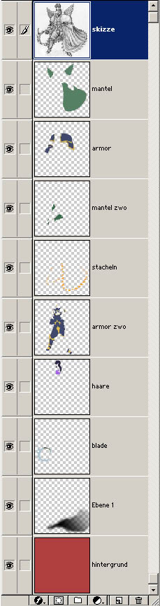 After coloring the sketch itself, we'll add a shadow now. Thatfor, take a softedged brush and black as color and paint the rough shape of the sketch on a new layer just above the background. Keep the direction of the light in mind, when doing so. Since shadows in most cases aren't solid, take a huge 400px-softedged eraser with about 30% opacity and erase the upper part of the shadow. Have a look at this screenshot of my layers for details.
Light and Shadow
Although the hardest part is finished now, we're not done, yet. Let's start to shade. Thatfor we're using to about 85% the Burn-Tool and a softedged brush.
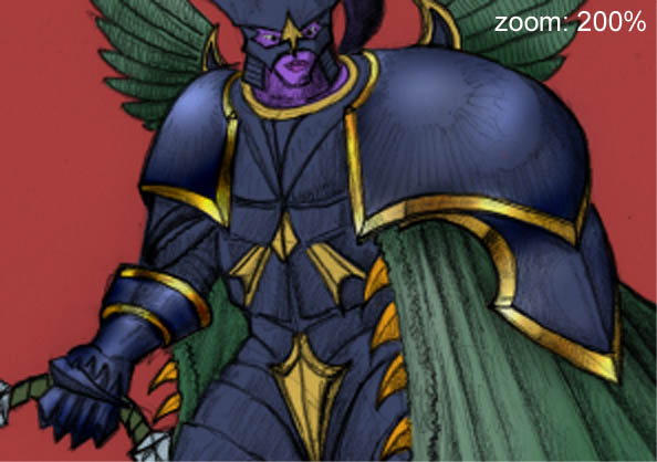
First make sure you know from what angle the light is coming from. A preshaded sketch offers lots of hints for this. The Warden, for example, has it's lightsource above and a little in front, righthand (roughly estimated). Lightspots on the armor and shadows in the coat are already set, too.
 Generally shading works like this: everywhere you click with the burntool, the color will be darkened, holding Alt while clicking will lighten it. But since you're not used to shading, you may make some mistakes. So before you begin to shade a layer, clone it with dragging it onto the "New Layer"-Icon to have the possibility to start from beginning, if needed. So let's start with the coat: lighten it on the left and darken it on the right, where it's nearly covered from the Warden. Add some darkness using a small brush where it hits the armor to create some drop shadow.
 While repeating this for every other part of the Warden, keep in mind, not to be afraid of very dark and very bright parts, if the surrounding makes it neccessary. So the inner part of the coat will be nearly black, because it's not hit by any light, while the right metalwing is kinda close to the lightsource and may be close to white. Remember: The harder and reflectiv the material is, the harder may the contrasts be.
 On the Shoulderpart of the armor, lighten the lightspots more and darken the already dark parts. Make sure to set the tools option on Highlights when brightening and to Shadows when darkening. Otherwise your painting will look all dull and dirty.
After repeating this for the rest of the Warden the painting looks more like a picture and less like a papercollage.
Background
Since no picture's finished without a background, we'll do this next. Some ppl just draw a gradient or paint odd lines in the background and call it "finished". Others (we) are doining it right.
Before you can start to add a background, you'll have to find one or draw it yourself. I prefer sources like Google.de or even DeviantArt, but pay attention that you have to ask for permission to use other artists work.
First, open the background and add it via copy/paste right above your former background. Then just drag it around a bit and resize it until you're satisfied with it's look. A Lightsource that fits the one in the sketch would be perfect.
With the creators agreement i chose "Tribute to Searches End" from abe123. As you see, the Warden just won't fit into the background nicely, so that's, where your work starts. Create a layer right below the sketch, a softedged big brush and a color that is somewhat similar to the lightsource (a light blue in this case) and begin to overpaint the parts that are brightened from the background.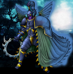 Since the lightsource is right of the Warden, i generously overpaint large parts of that side with my blue color. Pay attention on logical faults: Since the armor is shadowed by the coat, we don't wanna to throw light on it, right? Now switch the Blendmode of this layer to Color Burn (sometimes other modes are working better, just play around a bit) and lower it's opacity to about 50%-80% (i chose 75%). But ew, what's that? We lightened up the background, too. The following trick will fix this. While holding Ctrl and Shift, click on each of your color-layers (not the current one) to load their selection. Now invert it by pressing Ctrl+Shift+I and hit Delete to remove outer lightning.
 But light needs shadow, so we create a new layer right below the lightgiving one and repeat what just done. Pick a dark blue this time and paint bottom and left of the Warden. The lower you get, the darker should your blue be so you create a nice flowing ... ehm.. flow. After done, don't set the layers blendmode to Color Dodge but choose Darken instead. If this keeps you unsatisfied, try Multiply instead. But now, all our nifty highlights on the blade and other metallic material is gone. So you want to grab a small softedged eraser and remove the shadow everywhere you want it to sparkle.
Epilogue
Of course there are many ways to color a sketch, so see this tutorial as an entry or rough guideline. Whenever you find a technique that fits you more, just stick to it.
Now i bet you're eager to see what i have created while you were reading this, so check out the finished Warden.
done.